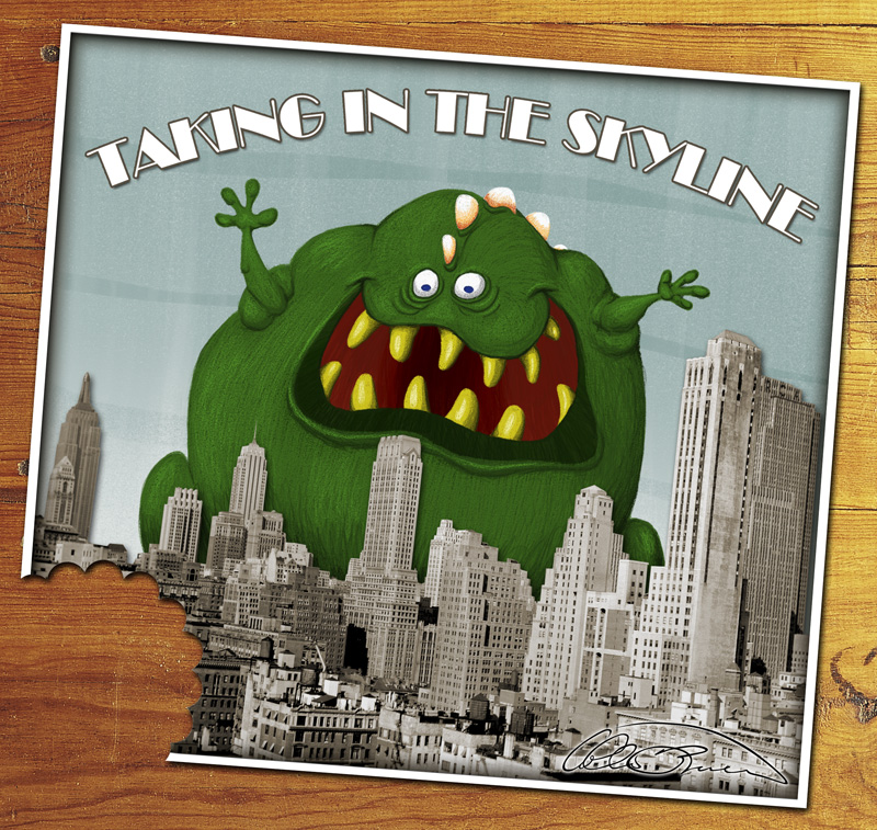
Breakdown of "Skyline"
All images are clickable to view at a larger size in a new window.
Programs: Photoshop CS2, ArtRage 2
Tablet: Wacom 'Intuos 2' 12" x 9"
Time: No accurate idea, but it felt like 3 hours spread over three days.
Layers: 12 before final Photoshop work : 16 for the final image.
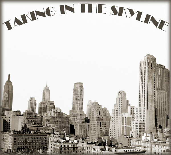
I know that I'm not that great at drawing scenery, particularly buildings, so for this Illustration Friday topic – "Skyline" – I decided to modify a pre-existing photo of a skyline. We have a wide variety of Photodiscs where I work, so I figured I had a good chance of finding a suitable photo there. And I did:
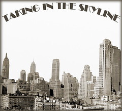
I opened the photo in Photoshop and, since it was originally black & white, I converted it to RGB and adjusted the hue/saturation to give it a bit of a brownish color. Not quite sepia tone. I also clipped the buildings from the original background and added the header that I planned on using at this point – font: Broadway BT – and a dark edged, fuzzy border for depth. Each of these elements – border, text, buildings and white background – were on their own layers and I saved the file as a PSD.
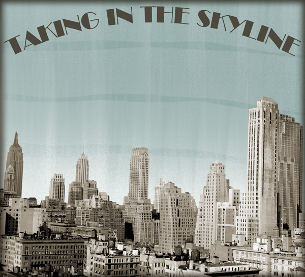
I then imported the PSD into ArtRage 2 and created a couple of layers behind the buildings to use for the background:
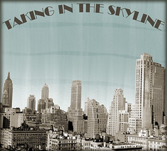
I created the background with the paint roller tool, by alternating horizontal blue strokes on the bottom layer, and vertical strokes of white starting at the bottom edge of the next layer up with the brush's "Thinners" setting at 94% and "Loading" set to 6% so that it would fade out halfway up the image.
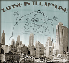
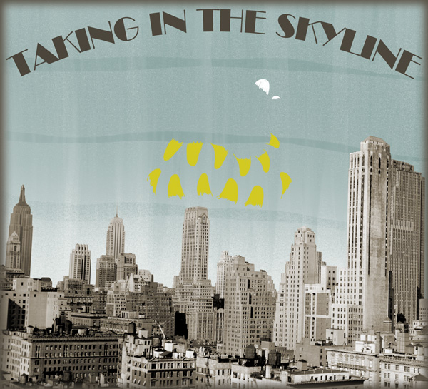
Next I created another layer between the sky and the buildings and sketched out my monster with the pencil tool:
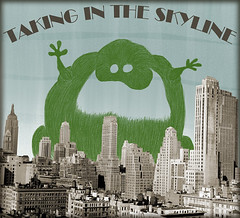
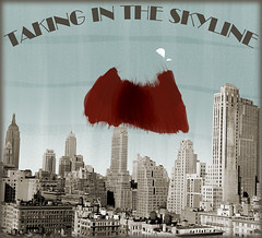
I dropped the opacity of that layer to approximately 30% and created yet another layer beneath it that I used for my first stage of coloring. That way I would be using the sketch layer as a template and it wouldn't interfere with my new lines as much as it tends to when I leave it black.
Sticking with the pencil tool I created the main layer of color that I would base everything else off of:
I turned off the sketch layer for the screenshot so the new lines wouldn't be obscured by the old lines. I noticed that I could still see the sky through the space between the lines, and I knew I wanted to darken it up a bit, so:
I added another layer below the first color layer and drew in a dark base using the marker tool and a slightly darker ink based off of the first color. I made the lip by placing even darker marker lines along the bottom of the lip. Tthen I used the paintbrush as a dry brush tool by setting the "thinner" to max and the "loading" to 0% and then pulling the darkest green across the lighter green.
I also added the white back spikes on the topmost sky layer in pencil because I wanted them to fall easily behind the bulk of the monster, but I didn't feel like making yet another layer just for that.
Then I moved on to the mouth:
I made it by adding yet another layer beneath the last layer and using the same marker and dry brushing technique that I used with the lip. Notice the floating white back spikes?
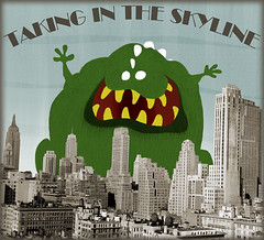
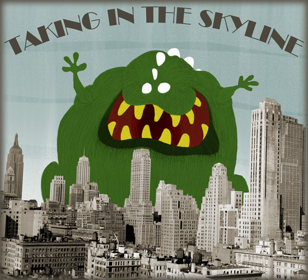
From there the next step was to make another layer and add in the teeth, once again using the pencil tool:

Now, there's no real need to work with so many layers; it's just something that I'm used to doing from many years of working with Photoshop. The main advantage is, if you mess something up you only mess up on that one layer. It also gives you a way to try out several different things without locking you into the first one you try. And finally, it works wonderfully for overlapping things that you may want to shift around later. As of now there's no way to shift things around in ArtRage 2, but that's why I work in a PSD format so that I can do it if I want to by taking it into Photoshop.
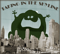
And speaking of layers, here's how it looks at this point with all of the main layers turned back on, and the sketch layer left off:
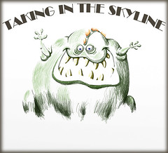
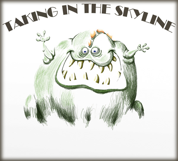
That just left the fine tuning provided by detailing with the pencil tool. Here is that layer, isolated from the rest:
Once that was done I saved the PSD, quit out of ArtRage 2 and opened the PSD in Photoshop. There I expanded my canvas size, added a white border to make it look more like a postcard, added a wood background, took a bite out of the image using layer masks and gave it a slight rotation:

And there you have it. I feel like it took longer to write all of this out then it did to make the original. I need to come up with a better way of doing this.
Until next time, have fun. Also, if you haven't checked ArtRage 2 out, give it a look. It's a pretty decent natural media art program at a really good price and it's only going to get better.
Programs: Photoshop CS2, ArtRage 2
Tablet: Wacom 'Intuos 2' 12" x 9"
Time: No accurate idea, but it felt like 3 hours spread over three days.
Layers: 12 before final Photoshop work : 16 for the final image.
I know that I'm not that great at drawing scenery, particularly buildings, so for this Illustration Friday topic – "Skyline" – I decided to modify a pre-existing photo of a skyline. We have a wide variety of Photodiscs where I work, so I figured I had a good chance of finding a suitable photo there. And I did:
I opened the photo in Photoshop and, since it was originally black & white, I converted it to RGB and adjusted the hue/saturation to give it a bit of a brownish color. Not quite sepia tone. I also clipped the buildings from the original background and added the header that I planned on using at this point – font: Broadway BT – and a dark edged, fuzzy border for depth. Each of these elements – border, text, buildings and white background – were on their own layers and I saved the file as a PSD.
I then imported the PSD into ArtRage 2 and created a couple of layers behind the buildings to use for the background:
I created the background with the paint roller tool, by alternating horizontal blue strokes on the bottom layer, and vertical strokes of white starting at the bottom edge of the next layer up with the brush's "Thinners" setting at 94% and "Loading" set to 6% so that it would fade out halfway up the image.
Next I created another layer between the sky and the buildings and sketched out my monster with the pencil tool:

I dropped the opacity of that layer to approximately 30% and created yet another layer beneath it that I used for my first stage of coloring. That way I would be using the sketch layer as a template and it wouldn't interfere with my new lines as much as it tends to when I leave it black.
Sticking with the pencil tool I created the main layer of color that I would base everything else off of:

I turned off the sketch layer for the screenshot so the new lines wouldn't be obscured by the old lines. I noticed that I could still see the sky through the space between the lines, and I knew I wanted to darken it up a bit, so:

I added another layer below the first color layer and drew in a dark base using the marker tool and a slightly darker ink based off of the first color. I made the lip by placing even darker marker lines along the bottom of the lip. Tthen I used the paintbrush as a dry brush tool by setting the "thinner" to max and the "loading" to 0% and then pulling the darkest green across the lighter green.
I also added the white back spikes on the topmost sky layer in pencil because I wanted them to fall easily behind the bulk of the monster, but I didn't feel like making yet another layer just for that.
Then I moved on to the mouth:

I made it by adding yet another layer beneath the last layer and using the same marker and dry brushing technique that I used with the lip. Notice the floating white back spikes?
From there the next step was to make another layer and add in the teeth, once again using the pencil tool:
Now, there's no real need to work with so many layers; it's just something that I'm used to doing from many years of working with Photoshop. The main advantage is, if you mess something up you only mess up on that one layer. It also gives you a way to try out several different things without locking you into the first one you try. And finally, it works wonderfully for overlapping things that you may want to shift around later. As of now there's no way to shift things around in ArtRage 2, but that's why I work in a PSD format so that I can do it if I want to by taking it into Photoshop.
And speaking of layers, here's how it looks at this point with all of the main layers turned back on, and the sketch layer left off:
That just left the fine tuning provided by detailing with the pencil tool. Here is that layer, isolated from the rest:
Once that was done I saved the PSD, quit out of ArtRage 2 and opened the PSD in Photoshop. There I expanded my canvas size, added a white border to make it look more like a postcard, added a wood background, took a bite out of the image using layer masks and gave it a slight rotation:
And there you have it. I feel like it took longer to write all of this out then it did to make the original. I need to come up with a better way of doing this.
Until next time, have fun. Also, if you haven't checked ArtRage 2 out, give it a look. It's a pretty decent natural media art program at a really good price and it's only going to get better.
posted by Collin at 10:14 AM
![]()


5 Comments:
Really cool indeed! I love every part of this illo entry. Thanks for the step-by-step!!
Collin,
Thanks again for the step by steps. I haven't played with the layering in ArtRage. After seeing this, now I will need to.
Thansk again!
WOW thats great seeing your process. Great illo.
Thanks for sharing! It's always cool to see how other creatives create. I love your image. Especially those yellow teeth!
"Taking in the skyline", yep that's for sure. Cool monster. Right up my alley...
Post a Comment
<< Home